There are companies that say they are environmentally friendly and companies that stand by being environmentally friendly. Arbor is the latter of the two, a catalog printed with soy based ink on FSC certified paper and a booth that doesn’t change year to year are just the beginning of it. It’s no secret that Arbor has been backing natural materials in snowboards for years.
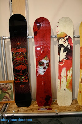
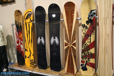
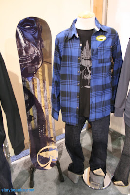
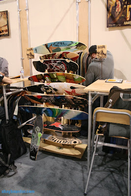
Arbor continues with graphics that compliment the wood cores, not completely cover and remove them. Every board in the 2010 line is an artist collaboration but you never miss that you are looking at an Arbor.
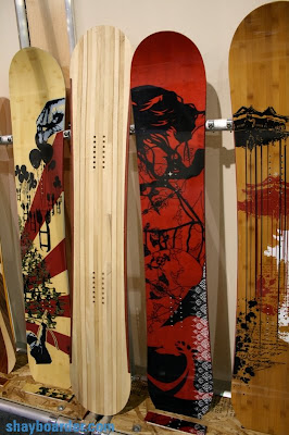 L-R: Wasteland topsheet and base, Abacus Topsheet (2 boards), A-Frame topsheet, Coda and core model.





Anonymous
February 20, 2009 at 3:10 pmArbor always has the raddest graphics. I have the first year wasteland 159 for my all mountain charger and luv it. And the structurn base really works when you hit the flat areas. The graphics this year make me want boards I don’t even need!
Thanks for posting Shay.
GhostintheToast
March 5, 2009 at 2:08 pmTotally agree, but I think I liked last year’s gfx better to be perfectly honest.
The skulls everywhere are tired. I like the clean, somewhat simple zen themes far better.
Great blog, I know your friend designed the new Coda but the silkprint art that was on last years board is an impossible act to follow.
GhostintheToast
March 15, 2009 at 11:40 amGod I just cannot get over how UGLY most of these designs are. Arbor, what were you thinking?? You old stuff was SO DAMN GOOD.
My wife was very seriously considering buying a Cadence or Push, but certainly not this year’s models. Looks like a Never Summer for her.
Arbor, if you’re going to go out on a limb with a ‘goth’ design lineup I suggest running duel designs with your normal, generally excellent and understated zen style as well!
disgusted,
Ghost
Shayboarder
March 15, 2009 at 10:33 pmEden definitely gets the beautiful graphics, cadence for 09-10 I am not a fan of but it was a good ride board…just not the most pleasing graphic.
Anonymous
April 6, 2009 at 9:47 pmWhatever is happening to the Crossbow? Are they not making it any more? Or has it changed into the Nightrain model?
Also is Arbor gonna be making any reverse camber/rockered bases next year?
Dammit Arbor, I hope you don’t screw things ups.
Shayboarder
April 8, 2009 at 10:54 pmNo crossbow, but looks like the nightrain will take it over or have similiar features..just a different size run. Hard to tell right now.
The reverse camber model is the draft.
Anonymous
May 6, 2009 at 1:53 amArbor boards ride really well, I love the company’s ethos and enviro stand but these graphics dont fit that at all, maybe they are going for the “hell yeah, thats so dope ” market. disapointed. Really loved their graphics from 2 seasons back. These suck
Nicholas
June 9, 2009 at 1:50 pmI think that Arbor have really cut out alot of their existing fans with these new graphics. Don't get me wrong some of them, in my opinion, surpass the 2009 models, the Westmark, Wasteland and the Del Ray all look Awesome. But, for me some of the beauty and simplicity of the boards has been lost, like in the case of the element. I love my 09 element but the 2010 element graphics just do not reflect the riding qualities of that board now; its not a death/skull type of company. Glad to see that the A-frame has remained the same though, that board has a sweet graphic! I was kind of hoping that the dove/crow graphic found on one of their 09 skateboards would appear on a board this year but alas no.
KayJee
June 16, 2009 at 1:45 pmIt’s the end of The Element as we know it! It’s hard to resist the temptation of making a change for the sake of change and Arbor too heeded to the call. New Element design denies itself. It used to be a symbol of tranquility, self assurance and uniqueness, now it’s a copy cat. Too sad…